Is your healthcare site looking outdated and boring?
But you want to attract more patients and improve your online presence. If there is a big YES from your side then you are at the right place. In today’s digital age, the best hospital website design is very important for healthcare providers. A bad website turns patients away. However, a good website builds trust and credibility.
That is why we have put together this list of top 11 healthcare website design examples and tips to create your website. These examples will inspire you to create a website that is visually appealing and informative. Also at the end, you can steal our effective tips to design the best healthcare sites for attracting more patients and growing your practice.
So what are you waiting for? Start building your cool medical websites today!
Top 11 Healthcare Website Design Examples
You can take inspiration from these top 11 medical practice website designs to either build or redesign your healthcare site in an attractive way:
1. Mayo Clinic
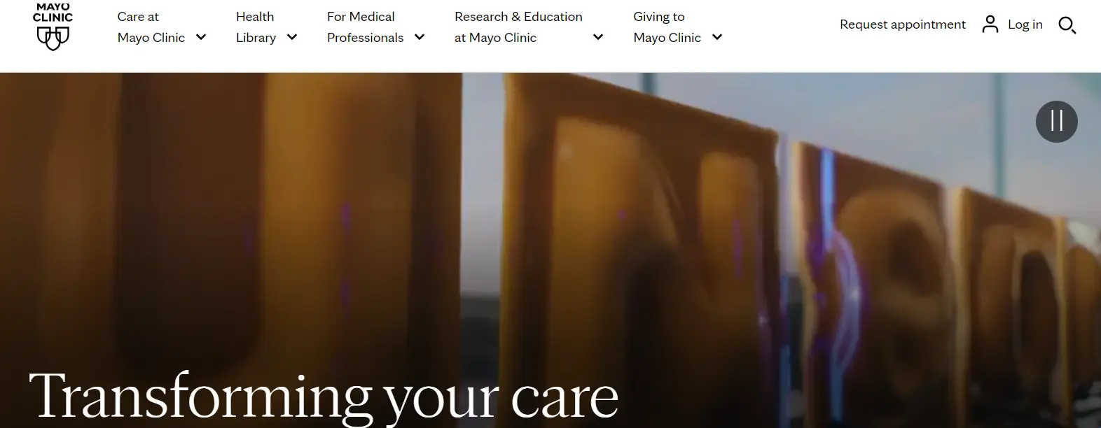
Mayo Clinic undoubtedly tops the list of the top 11 healthcare website examples. If you are located in the US, you probably have either visited this clinic or stumbled on its website.
But a question would arise in everyone’s mind;
What do you like about Mayo Clinic’s website?
Well, here are some of the basic and major reasons why the web design of the Mayo Clinic is top-notch:
- A greeting video.
- Use a simple yet attractive background color.
- An overview of its all branches and links to the overview of each along with their directions.
- Information about a vast variety of diseases, and ways to cure them.
- Easy way to book an appointment and easy to navigate.
Moreover, Mayo is among the best healthcare websites for patients. It allows patients to easily access educational resources. They can even look for Mayo’s specialties in the section named “Care Areas”.
2. Cleveland Clinic
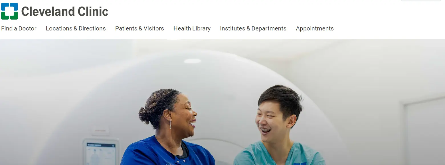
Another top medical web design of this article is Cleveland. This hospital has been ranked as one of the best US hospitals for several years.
Here is what we liked the most about Cleveland as being one of the most popular health sites:
- A catchy introductory phrase.
- An important feature of “Express Online Care” is to allow virtual checkups.
- A search option to look for information about several diseases and their treatments.
That is why Cleveland is among the best sites for health information. Common people and patients can access health information on this site in just one click.
3. One Medical
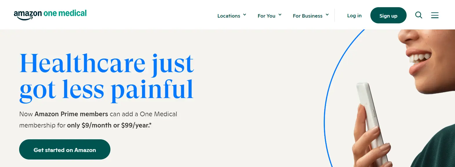
Among the best website templates for healthcare, One Medical has leveraged the use of a single responsive design.
We liked these things the most about One Medical:
- A video on the web page showing advanced healthcare techniques.
- An option of virtual care and same-day appointments.
- A link to the COVID information and a notification banner at the top about important updates.
This healthcare provider provides exceptional health services in the US. It attracts 1M+ visitors monthly due to its lucrative medical web page design.
4. Rest Assured
Seniors and disabled people find Rest Assured to be their best friends in hard times. Its header conveys this message of its objective clearly and concisely.
That is why, we think this hospital has the best medical web design:
- This website design features videos of seniors and people with disabilities.
- It offers online monitoring technology.
- Best display of the benefits that its targeted audience can enjoy.
Their positive testimonials add 5 stars to the positivity they can bring to the patients’ lives. So you can use this website for medical clinic design ideas.
5. Synergy Private Health
One of the good medical websites is Synergy Private Health. It offers healthcare, cardiology, and other basic healthcare services.
These are our favorite things about the web design of Synergy:
- There are attractive and explanatory sliding images on the first page.
- There is a blog about health tips.
- Synergy’s website also showcases a professional library of videos and webinars on wellness and cooking.
That is why Synergy is not only one of the best medical information websites. Instead, it is a shop for various health concerns especially cardiology as stated by Dr. Kimberly Parks.
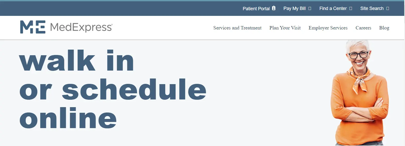
6. MedExpress
MedExpress is among the leading and trusted medical sites. Patients find it helpful for providing wellness, injury, and other healthcare services.
Medical website designers have bent over backward in designing this website due to the given features:
- Information about the locations and numbers of centers on the homepage of MedExpress.
- Option to book an urgent virtual checkup or an in-person appointment.
- An easy option to search for medical services near patients.
We included MedExpress in our list of the best healthcare site design examples due to its ease of use. Everything is available to patients from searching their nearby branches to exploring a blog on wellness tips on the homepage.
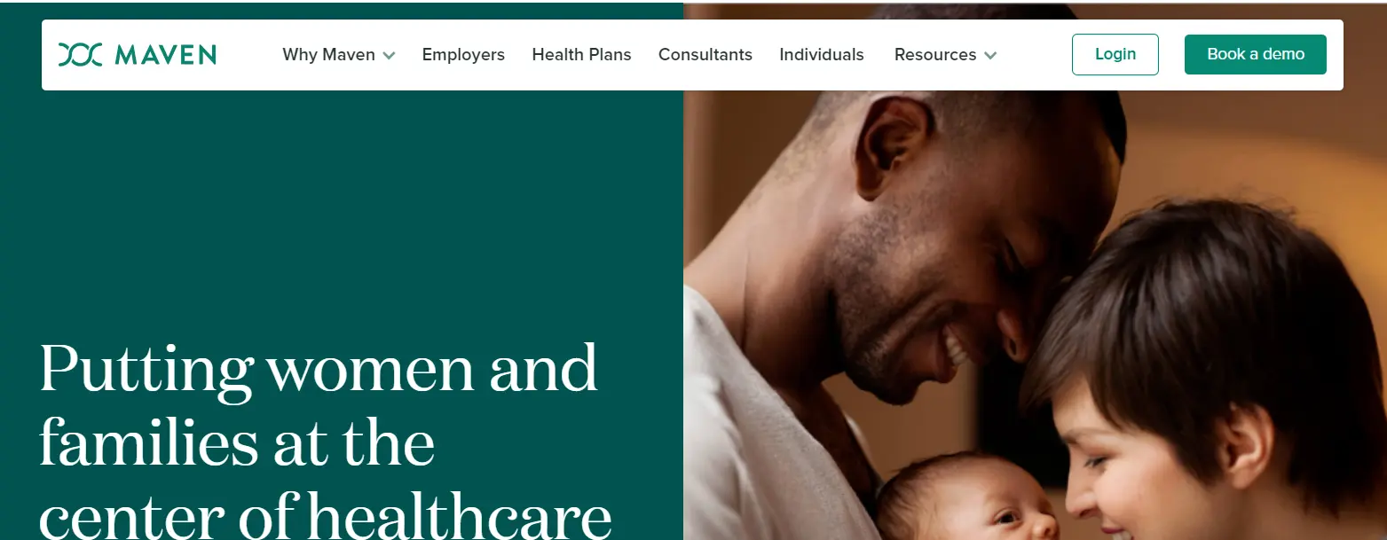
7. Maven Clinic
Women and families admire Maven Clinic because of its specialty for these groups. It offers patients with affordable services. So that they don’t have to ignore their health due to rising health costs.
This is what makes Maven Clinic the best inspiration for web design for doctors:
- A friendly and benevolent header on the homepage.
- Green and white background color to increase the freshness and cleanliness of the website.
- A strong call to action to order their services urgently.
Women can contact this hospital 24/7 for various feminine issues like maternity, menopause, and fertility. That is why, it is undoubtedly the best healthcare site design for families to date.
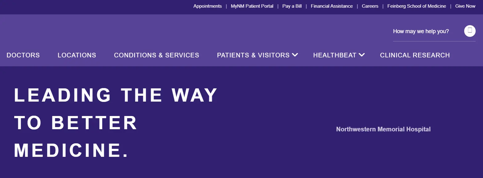
8. Northwestern Medicine
You know, the best health website design always targets simplicity and authenticity. This is exactly what Northwestern Medicine has done by becoming the simple healthcare design example. It has taken advantage of simple hero images to grab the attention of the patients, general people, and medical practitioners.
These things ultimately line up Northwestern Medicine in the best healthcare site examples:
- The homepage has a dark background with concise yet targeting sections.
- Several options for immediate care, booking an appointment, and checking patient profiles.
- Targeted hero images according to the pain points of the patients.
But these impressive factors don’t stop here. Rather they continue, where you will find links as well. These are the immediate options to quickly head over to your desired section of the blog or website.
9. Rush Medical Institute
Are you in search of good websites for health information?
If yes then you will never regret choosing Rush Medical Center for this purpose. This website provides you with plenty of information about the healthcare field in engaging and simple ways.
We consider Rush Medical Center as the best website design for medical doctors due to:
- An effective hero image of a doctor treating a patient.
- Easy option on the homepage to find a doctor near you in Chicago.
- A series of achievements handwritten by the experts of Rush Institute.
- Convenient ways to search for the nearest Rush centers and book appointments.
This medical center is nothing less than a blessing in this age. The reason is its facility to let people understand healthcare through research, education, and innovative ideas.
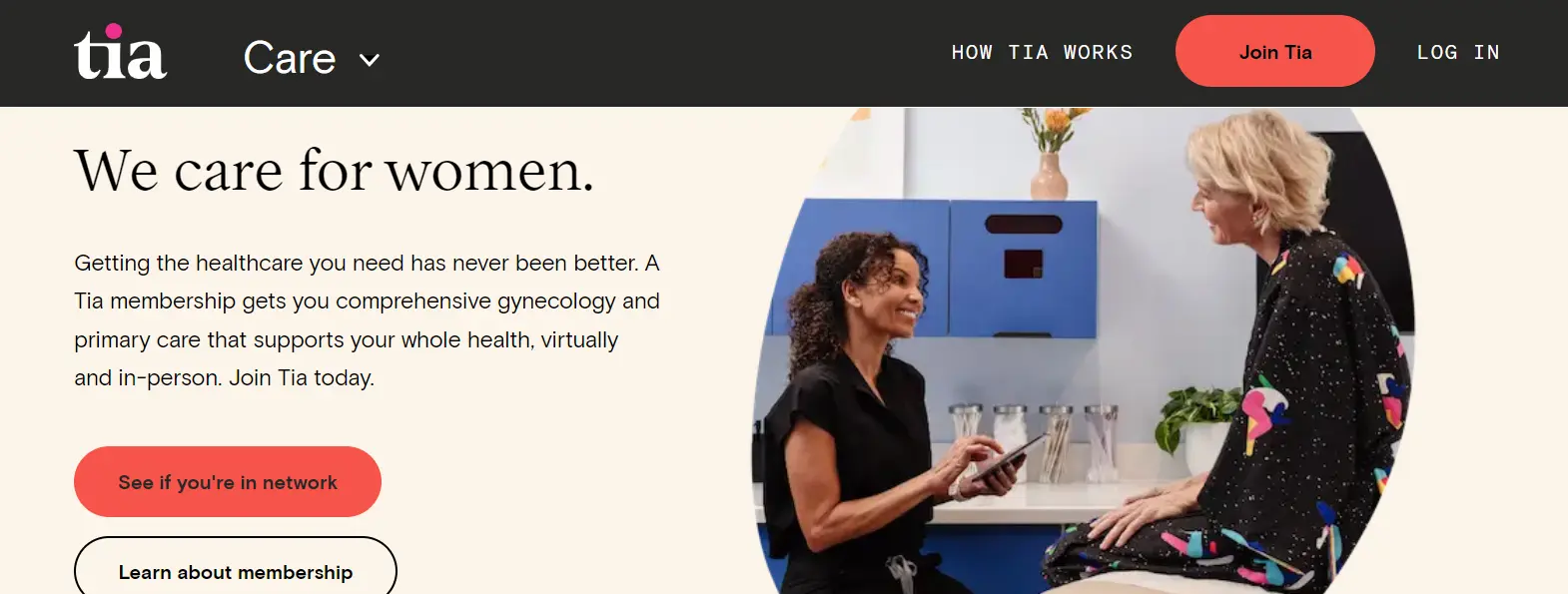
10. Tia Medical Center
Tia is the leading website for women and assigned female at birth (AFAB) people. This website welcomes its targeted audience with bold colors and tones.
These are our favorite things about this website design for healthcare:
- Eye-catching and professional photography that is relevant to the core objective of Tia.
- Yellow, orange, and purple colors to differentiate things for the brow background.
- Clear details about their services like gynecology, mental health, wellness, and other healthcare facilities.
The beauty of this medical website design is the use of neutral colors. Their audience finds it intriguing to have welcoming and warm colors in the background.
11. HealthMatch
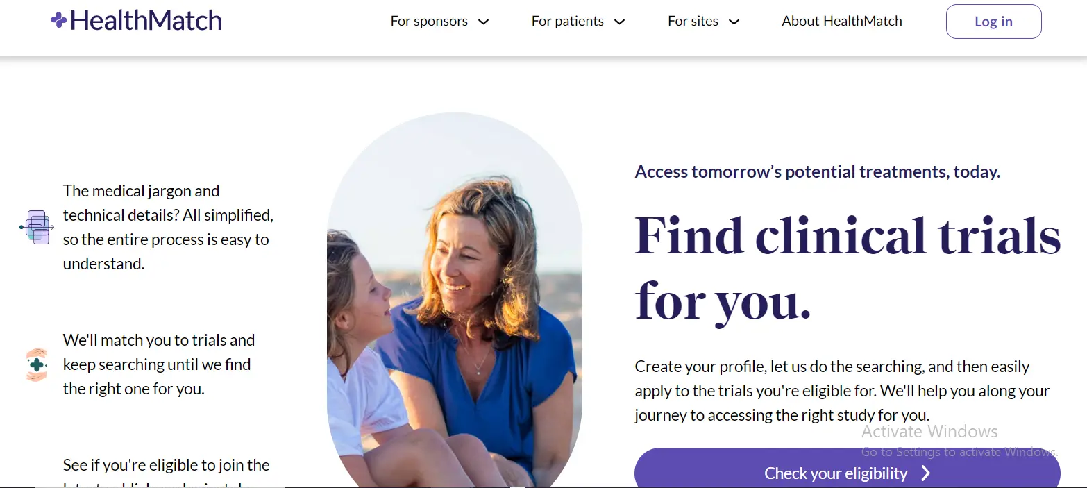
The primary objective of HealthMatch is to help patients find the best medical trials for them. Certainly, this hospital website design is known for its white spacing. This color gives a clean and refreshing look to your eyes whenever you visit it.
These features lead HealthMatch to be among the top healthcare websites:
- An eligibility checker to see if the required services of a patient are available or not.
- Easy-to-navigate website.
- Clear designs with options for opening other pages and drop-down menus for sub-topics.
What we have seen is that patients mostly like their blog about health and wellness tips. It happened because their content is backed by lots of genuine research, facts, and valuable data.
How to Design Best Medical Websites?
You will see healthcare site designers following the exact steps for designing the best healthcare site:
- Look at other healthcare sites for inspiration.
- Choose a Content Management System (CMS) such as WordPress, Joomla, Drupal, Wix, Squarespace, etc.
- Pick a design template or theme.
- Customize the template to match your brand.
- Make your website work well on mobile devices.
- Ensure everyone can access your website.
- Include only useful and functional features.
- Keep navigation and search tools simple.
- Focus on high-quality and engaging content.
- Use a clean design to reduce distractions.
FAQs
What is the best color for a healthcare website?
The best colors for a healthcare site are blue, green, and white. It is because the blue color represents trust and calmness. However, green feels healthy and fresh. Moreover, white color is best for keeping things simple and clean.
What are the special features of a healthcare medical website?
Important features of a healthcare email website are an easily available contact form, a convenient booking system, a patient portal, clear information about your healthcare services, and a healthcare blog.
Why are patient testimonials important in designing the best hospital websites?
Patient testimonials are important because they help people trust the hospital. If these testimonials are good then they show the hospital cares about its patients. Therefore new patients can comfortably choose the respective hospital.
What makes a healthcare website design effective?
A good healthcare site design is always simple and easy to use. It must focus on the user’s needs. Moreover, it should include things like contact info, services, and patient resources. Features like appointment booking and online chat make it even better.
Why are visuals important in healthcare website design?
Visuals like videos and pictures make complex things more understandable. They also play a big role in making the website more engaging and reassuring for the visitors. So you can think about adding high-quality visuals of your staff and services. This will ultimately build trust with potential patients.
How can I ensure my healthcare website is mobile-friendly?
Use a responsive design to ensure your healthcare site is mobile-friendly. It means that the website will adjust to different sizes on smartphones and tablets. For this purpose, try your site on different devices to ensure the features work well on small screens.
How can SEO improve my healthcare website\’s visibility?
SEO (Search Engine Optimisation) improves the ranking of your healthcare site on various engines like Google. You can consider using relevant keywords like “healthcare services” or “medical consultation” in your content. However, having a clear and catchy medical web design along with clear headings, and meta descriptions would definitely help in increasing the site’s visibility to attract more visitors.
How much does a healthcare Website Design Cost?
The price for a healthcare website starts at $1,500 and may reach $15,000 depending on the required features. Please check this blog article to find out the pricing of a healthcare website in 2024!
Want the Best Healthcare Website Design?
To sum up, great medical websites are easy to navigate, have the right colors and also include some exciting features like patient testimonials and appointment booking options. However, there is no doubt that good visuals also make your site more welcoming and trustworthy. Similarly, patients would like it if you have a mobile-friendly site that can operate easily on small screens as well.
So these are enough ideas to make an engaging healthcare site of your own. You can design it according to your targeted patients that specifically support them. If you don’t have expertise in designing then you should consider Wowbix for expert help. This medical website design company spares no effort in bringing your dream medical site to life or either helps you with a website redesign.

