Are you an ophthalmologist, medical website designer, or any healthcare provider in search of the best ophthalmology website design examples?
Do you want to attract new patients in this competitive market and grow your business as an ophthalmologist? If so then you are in the right place. This article will explore the top 12 ophthalmology website designs proven to increase conversions.
These websites represent the best practices for driving patient engagement and capturing attention from stunning web visuals to easy navigation. You can get valuable inspiration from them to create a website that effectively represents your brand and attracts more patients.
1. Vision Veritas
The 1st best ophthalmology web design ranking in today’s article is Vision Veritas. These factors make this eyecare website one of the best ophthalmology web design examples:
- Calming color scheme.
- Easy navigation across the website.
- Representation of services in an attractive order.
Their web design highlights a range of their ophthalmology services. Their treatments range from routine checkups to specialized surgeries.
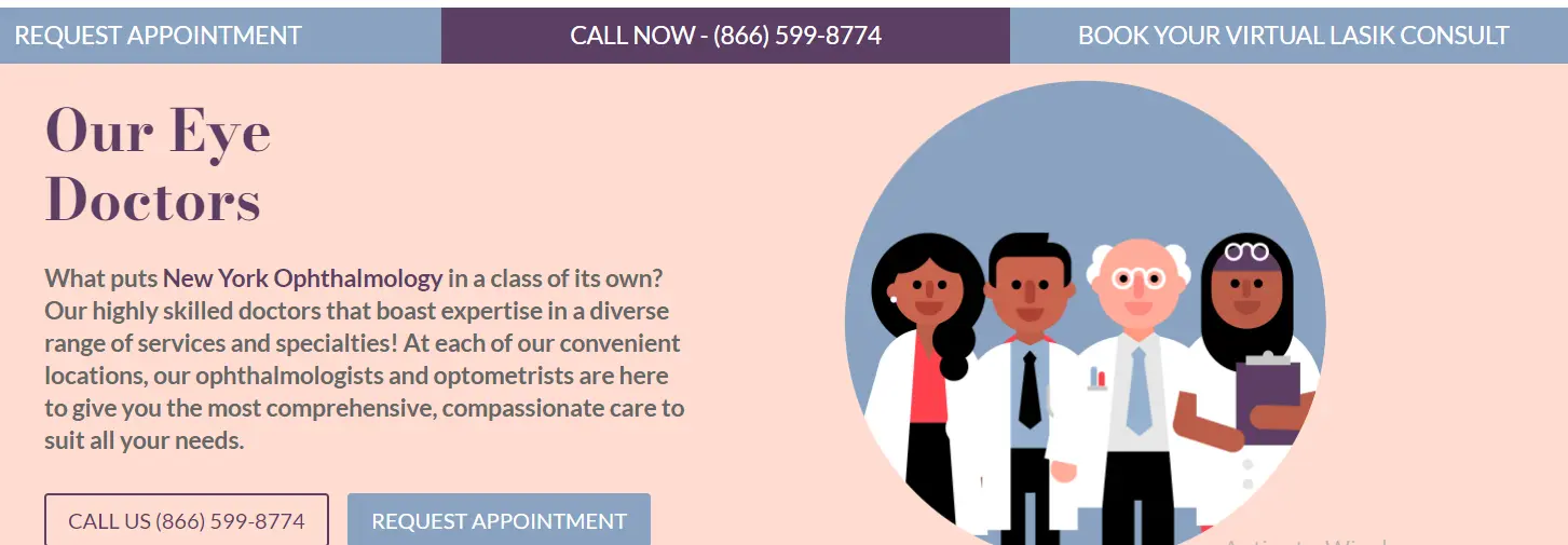
2. New York Ophthalmology
Next is the eye-catching design of New York Ophthalmology. Their web design is the top one because of:
- Clear sections on staff information, treatments, and patient testimonials.
- A sleek and user-friendly design.
- Easy options to book appointments and learn more about their eye care services.
It provides routine visual checkups and expert eye care like cataracts and LASIK to people of all ages.
3. Texas Eye Surgeons
Texas Eye Surgeons has undoubtedly marked their name in the list of the best ophthalmology web design examples. The specialties of its web design include:
- Modern layout.
- Quick access to all eye care services.
- Detailed pages on surgeries, patient education, and contact information.
Its medical web designers spare no effort to make the site visually appealing and helpful for patients.
4. Kraff Eye Institute
Kraff Eye Institute is known for its innovative treatments and advanced technology in ophthalmology. Here is what makes its web design so special that it has increased its conversions:
- Clean design with a user-friendly interface.
- Easy system to schedule appointments.
- Detailed information about their vision correction procedures.
These things have ultimately made its website stand out among the crowd of such competitive ophthalmology businesses.
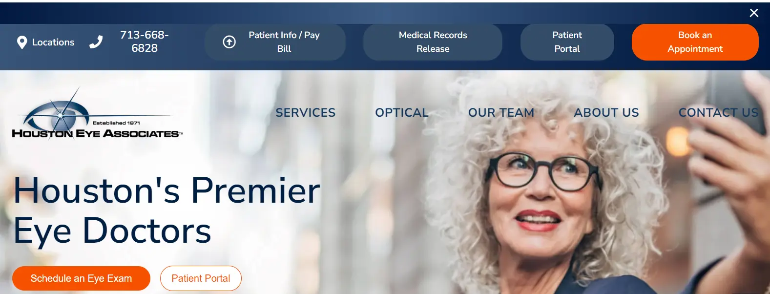
5. Houston Eye Associates
Laser vision correction and cataract surgery are offered by Houston Eye Associates through its stunning medical website having:
- A professional look with blue color.
- Clear options of services.
- Intriguing options for showcasing patient reviews and educational resources.
Their website designers have taken the simplest yet most effective steps to attracting patients.
6. Denison
Denison is popular for providing pediatric ophthalmology services through a website with:
- Simple layout with important service details.
- Easy options for booking appointments.
- Clear tips and advice on eye care.
These things lead Denison to a more practical and professional design.
7. Northwest Eye Surgeon
Another best ophthalmology website designs of Northwest Eye Surgeon is renowned due to:
- Professional design with a well-organized services option.
- Detailed descriptions of treatments.
- Simple contact form.
These designing strategies have helped them drive thousands of eye patients.
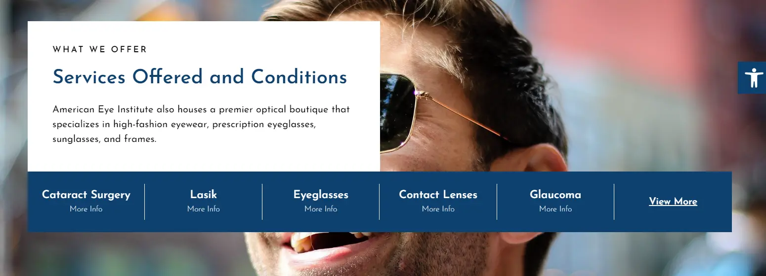
8. American Eye Institute Los Angeles
American Eye Institute aims to make online health information easy for patients through a website that is:
- Designed sleekly with an emphasis on LASIK and laser correction.
- Prominent patient testimonials.
- Coherent booking option for seamless scheduling.
They have a team of skilled ophthalmologists in Los Angeles and attract visitors online through the above web designing ways.
9. Carrot Eye Center
Carrot Eye Center has an attractive ophthalmology website design because of a:
- A vibrant website that highlights a range of services.
- Easy navigation for quick access to services.
- An option for an online vision quiz to assess your eyesight.
You will never be disappointed with their personalized eye care solutions.
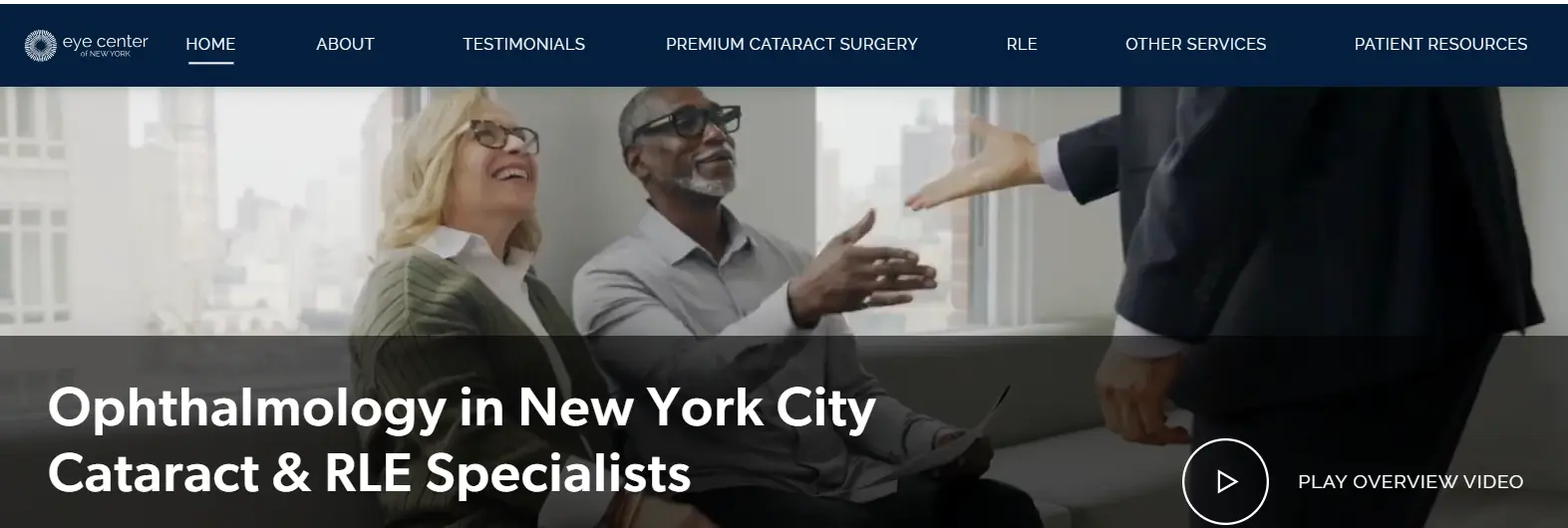
10. Eye Center of New York
A comprehensive eye care provider in the New York metropolitan area is Eye Center of New York with a website design that is:
- Accessible and modern design.
- User-friendly reviews section.
- Convenient online system for booking.
These little steps ultimately led to making this design one of the best ophthalmology website design examples.
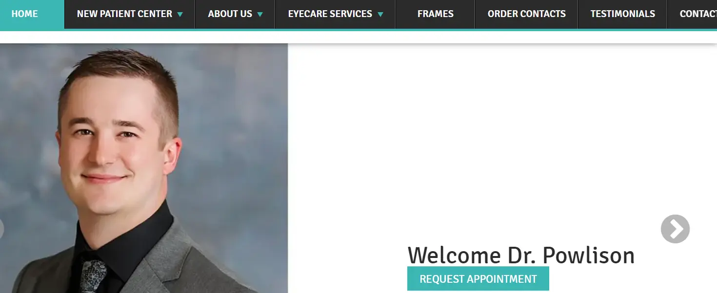
11. Eduardo Besser, MD
Patients of refractive surgery and corneal transplantation have greatly benefited from Eduardo Besser. It keeps welcoming new ophthalmology patients with a stunning web design due to the following:
- Professional and patient-centered design.
- Detailed information about specialty services.
- Easy appointment scheduler for fast bookings.
A unique feature of this eye care website is its separate and prominent sections for doctors besides just patients.
12. Eye Surgeon, PC
Last of the top 12 ophthalmology website designs is Eye Surgeon in the U.S which has:
- Straightforward design with clear information on treatments.
- Quick access to the important sections.
- Featured materials for the education of patients.
They provide a sea of eye care treatments ranging from glaucoma management and retinal surgery.
How to Build a Stunning Ophthalmology Web Design
There are billions of people around the globe. And making your ophthalmology services easily available to them can be kind of hard. That is why, marketing professionals suggest you take advantage of the internet.
But why?
Because nowadays almost everybody has a phone with an internet facility in their hands whether they are seniors, adults, or kids. This way presenting your business to them through the internet can do wonders as around 92% of people seek health information online.
So you can leverage this internet as a word of mouth for your ophthalmology website. You can hire a professional web designer to design an eye-catching website. But you too can design your website with the help of the given easiest 8 steps:
- Use a clear and modern design according to the trends of the ophthalmology industry. It must be easy to navigate.
- Add high-quality images and videos of your ophthalmology practice.
- Provide clear information about your services in a concise and crunchy way.
- Use strong calls to action to encourage patients to contact you.
- Optimize your website for SEO.
- Ensure your website is mobile-friendly.
- Track instructions of your patients through an effective patient relationship management system (PRM). It will help doctors view the patients’ information anytime.
- Use specific tools like Google Analytics to track the progress of your website. It helps you see how many people visit your site and what they do there.
What are the Common Features of Best Ophthalmology Website Designs?
There are a plethora of things to consider before designing your ophthalmology website. But here are the most important features you need to include in your website:
- An easy way to book appointments.
- Details about your services.
- Patient forms.
- Contact information.
- Previous patients’ reviews.
- Clear and easy navigation.
- High-quality images and videos to showcase your expertise.
- Mobile-friendly site to look great on different devices.
- Ophthalmology blog or news section to inform patients about the latest in eye care.
Get the Best Ophthalmology Website Design with Wowbix
In the end, having an outstanding ophthalmology website is quite important if you are interested in attracting new patients and growing your practice. You can somehow design such websites yourself. But if you are not an experienced web designer then we recommend you go for a professional web designing company.
One affordable and best ophthalmology website designing company is Wowbix. You can consider partnering with us. Our experts will ensure your ophthalmology site loads faster, has an attractive design, is easy to use, and drives conversions at just a few bucks without compromising the quality. So why not book your free consultation today towards a bright ophthalmology future?
FAQs About the Top Ophthalmology Website Designs
Why do eye doctors need help from a website design company?
The job of eye doctors is to focus on treating patients and not on building websites. Therefore a healthcare web designing company helps such doctors design a good-looking website. The purpose of this ophthalmology website is to showcase the services of the doctor and attract new patients.
How much does hiring a company to design an ophthalmology website cost?
The cost of hiring an ophthalmology web design company can cost you something between $2,000-$10,000. But these charges are not fixed. They vary according to the project’s scope, design requirements, the company’s reputation, the size of the website, and the features it needs.
How long does it take to build a website for ophthalmology with a design company?
It might take a few weeks to months to design a good ophthalmology website. A simple website would be ready in just 2-4 weeks. However, a bigger and more complex website will take around 3 months to complete.
How can I make my ophthalmology website look attractive?
You can make your ophthalmology website stand out by using attractive pictures, easy-to-read text, and helpful information. It should be simple to use. This way patients can easily and quickly find what they are looking for. Also, the website should have a clear design and a fast loading time to make it more attractive.
Can a website design company help make sure the ophthalmology site follows HIPAA rules?
Yes, a good website design company ensures your website follows HIPAA Rules. This set of rules helps web designers confirm the safety of patient information such as online forms and portals, etc.


